The letterpress effect is now becoming more and more common in web design. Normally the reserve of the world of print, thanks to the advancement of browsers of late we can achieve this effect ourselves. Applying the letterpress effect to headings or navigation gives it that little ‘wow factor’, making it stand out. The effect is minimalist and subtle but can make a huge difference to the way your iWeb site looks.
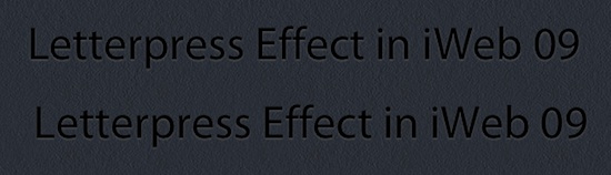
Being iWeb users we are for once spoilt for choice on how to achieve this effect we can use either the font menu and image tab within iWeb’s Inspector or we can be clever and use an HTML Snippet. In this tutorial I will explain both methods, and which one I would choose.Take a look at the image below. Both examples of text look identical, but they are each created in a completely different way.

The top sentence is created using a standard iWeb text-box and a little bit of fancy work within using iWeb’s Inspector. The key to the Letterpress effect is to use the shadow effect (but only very slightly) and to use a lighter color for the shadow rather than a darker one.

Here you can see that I have selected black for the text, light gray for the shadow but only given it a blur of 3 pt and an offset of 1 pt. Finally I have set the offset angle to 270 degrees and the opacity to 75%.
If you take a look at the lower example in the image below you will see that it is all created in an HTML Snippet.

All that has been done is to wrap the phrase in a little bit of CSS giving it that little bit of a glow to the lower portions of each letter and making it look as if the letters are pressed into the page. And being CSS it is fully customisable, below is the code you can use in your iWeb site with the portions in red showing the parts you can change.
<p style="font-family: Verdana, Arial, sans-serif;
font-size: 48px; color: #000;
text-shadow: 0px 1px 2px #555;">Your text in here</p>
Taking the code bit by bit you can change the font to fit the rest of your site, if you are using a non-standard font it pays to include one in this list too just in case a visitor to your site doesn’t have it installed on their computer.
Next up is font-size and once again pick one that fits your site. This is followed by a color (in my example #000 which is black); this is the color of your font.
Finally we get to the text-shadow, the first number (0px) relates to the x-offset (left and right), the second figure (1px) relates to the y-offset (up and down) and the third number (2px) relates to the amount of blur you want the shadow to have. This is followed by another color, this time the color of the text-shadow.
You can play about with any of these settings to get your desired effect. Of course you are not limited to the letterpress effect, you may want to start using this method to apply shadows to your text, the difference being that the letterpress effect uses a light color shadow to highlight whereas a regular shadow is a darker color.
So which method should I use?
Quite frankly it’s up to you, but here is my explanaition which may help you decide. If you plump for the first method and apply a shadow to your text using iWeb’s Inspector then iWeb will turn the text into an image. This will give you no SEO advantage whatsoever. It may quicker and easier but you lose out in the long run. Of course you can always use the iWeb SEO Tool from Rage Software and rename the image afterwards. In addition, if the text is an image screen readers can’t read it, so if you use it for the title of your site screen reader users will think your iWeb site is called something along the lines of ‘shape_1.png’.
If you opt for the second method the effect is the same but the text is readable by all. Okay so not all browsers support the text-shadow css tag but they are getting there. And if a visitor to your site hasn’t got an up-to-date browser the text will still display, but just without the shadow. So if screen readers can read the text too so can search engine spiders, so there’s another plus.
And there you have it, everything you needed to know about getting the letterpress effect in iWeb. If you use this effect in your iWeb site why not leave a comment with a link so we can all take a look.


Hi Tim,
How do you get your font ‘bold’? (html-snippet)
Hi,
Just add a bit more code into the snippet:
font-weight: bold;
I hope that helps,
Tim
Excellent tip!!!
Thanks,
Brandon