Typography in web design is becoming more important than ever before. Once the realm of print designers we, as iWeb users, should be paying more attention to how text appears on our iWeb pages.
Typography is more than just picking a font we think looks nice and plastering it all over our iWeb site. It involves such things as clever use of headings, proper line spacing and the use of lists or bullets. It means making your content readable for all, without visitors getting a migraine after just reading 3 lines of your text.
The beauty of iWeb is that we have the ability to control all of our typography simply and effectively without mucking about with the CSS; we have Inspector.

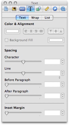
The forth icon in from the left (the capital T) is the text menu and within this portion of Inspector we have all the tools necessary to change the colors, alignments, line spacings, margins, bullets, numbers and text wrap.
The forth icon in from the left (the capital T) is the text menu and within this portion of Inspector we have all the necessary tools to change the colors, alignments, line spacings, margins, bullets, numbers and text wrap.
So why do we have to bother with typography?
In iWeb there are a few reasons. To begin with there is a speed issue. It is a common side effect of iWeb that pages load a little slower than average, but did you know that plain, common fonts load quicker than images; if you want a quicker loading iWeb page consider using more text and less images.
Then there is accessibility. The more people who can read your iWeb site the better. So if you pick a rare and/or bizarre font to use on your site or you convert all your text into images you will be limiting the potential audience of your iWeb site.
In addition major search engines place more emphasis on keywords that are placed within headings, page titles and content; so you will be helping your SEO along the way.
An easy to read iWeb site is one that will get many repeat visitors.
Using Inspector we can adjust the line spacing to make the text of our body content more readable. The same goes for paragraph spacing too, if we have more than one in a text-box.

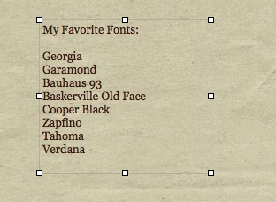
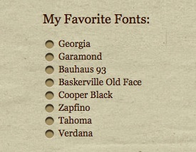
Adding bullets from the list selection of Inspector makes our list easier to read and stand-out.


Make your headings stand-out using the Fonts Inspector; readers should be able to tell what your post/web-site is all about at a glance.


One thing I (personally) wouldn’t change in Inspector however is the ‘Inset Margin’. One of the problems Internet Explorer has with web-sites (iWeb included) is the way it interprets margins and padding. By leaving this setting as it is we are not giving the world’s most popular browser a chance to muck up your iWeb site anymore than it already does.
Here are a few beautifully designed, typography based sites for you to take some inspiration from.


Thanks,
another good and interesting post!
Keep them rolling.
Ro
Hi,
I just launched a website using iweb and i’m having a terrible problem with size of fonts. I’m using ‘gill sans’ with a combination of light, regular and dark shading. When i select regular or dark it make the font go totally out of sync/size with the surrounding lighter font. Any suggestions how to amend this?
Thanks in advance,
Beck
[…] Continued here: iWeb and Typography […]
For the great insight into this, but for the life of me, when I implemented the bullets and then published to a folder so that I could review the result, what I get are numbers and bullets together. Furthermore, I am not able to adjust the spacing (inset margins) for wrapped around sentences. They either start too early or too late. Any suggestions you can offer?
Cheers!
I am creating a web site and having trouble with how the text smashes itself up against the left side of the text box. A lot of my text boxes are colored and it shows. The “Spacing” in “Text” doesn’t do anything to help.