As I have said many times before I look at loads of iWeb sites everyday. I also look at a lot of non-iWeb sites too and, in particular I like to read the blogs of graphic and web designers. As you can imagine there is a huge difference in the standard of sites being produced between the two different user groups, but there are things you can do to your iWeb site to give it a more modern and crisp feel. Subtle changes and little tweaks here and there are all that is required, so here are a few ideas.
In order to help me explain further the points I have listed below all of the screen shots in this post are taken from non-iWeb sites unless otherwise stated.
Gradients
Since the arrival of ‘Web 2.0’ all those years ago gradients have had their place in web-design. However there is knack to getting them right. We are not talking a multi-color rainbow gradient or even one of 2 difference colors; there is a word to remember: subtlety.
Adding these subtle gradients to your iWeb sites (as with lighting and shadows below) gives your iWeb site depth and prevents it from looking flat and boring; but the changes between color must be minimal. Gradients can be used to draw attention to areas of your iWeb site, for example the logo in the image above.
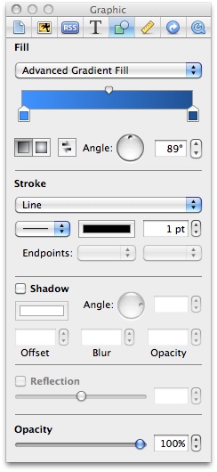
Creating gradients in iWeb 09 is now really simple and can all be done through ‘Inspector’. The trick is to select your colors carefully.
Lighting
Strictly speaking this could be included in the gradient category above as you can use them to add lighting to your iWeb site. Lighting also adds depth to a web-page and can be used to highlight areas of importance such as a product or logo.
As a rule lighting sources should come from ‘above’, it’s what our eyes and brains are accustomed to. Adding light to an iWeb page could be as simple as a 1px line above an element, to make it lift from the page. And of course where you have light you also have…
Shadows
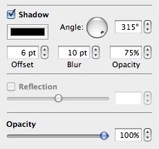
Another area where less is more. Gone are the days where huge dark shadows appeared all over the www. Subtle shadows with only a few pixels offset is the order of the day. The default settings for iWeb are a little harsh, normally 6px offset with a 10px blur. These, along with the color of the shadow can be changed within Inspector.
I mention the color there as having a black shadow doesn’t always look right either. Why not pick a shadow the same color as the background to get something far more realistic. If you don’t want to use the shadow settings in Inspector you can try the reverse of the method applied to add lighting; simply place a 1px thick line just below an element to give it a shadow. There are some lovely subtle shadow elements in the header section of the site below.
1px Lines
These are becoming more and more common in standard web design and are used, again to provide depth to a page. Rather than use the lines to add light or shadow above or below an element on your iWeb page you should use them as physical parts of the page; as dividers. In the image below, you can see how the web designer has inserted a thin line between the nav-bar elements and as an internal border to the header image.
Just like white space can be used effectively to break up a page to make it easier to read, so can a few fine lines. By adding 2 lines together, one dark and one light, you can give the illusion of a groove in your iWeb-page. You can see from the examples below how this effect looks.
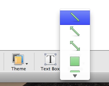
Achieving this in iWeb is a piece of cake using the ‘Shapes’ menu, a bit of copy/pasting and Inspector.
So you see, adding a few subtle changes to your iWeb site can give you a more modern, professional look for not much work. Don’t settle for the default settings, they are invariably too harsh. Keep gradient colors similar, shadows small and fine lines just that…fine.
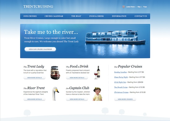
Here is an example of a web-site that has it all. Lighting, gradients fine lines and shadows.
Have you made subtle changes to your iWeb site? Leave a comment and share your work.








Okay, I am a huge fan of super-cool websites. I admittedly am not a web designer. With all that said, I do own a semi-technologically focused company, a mobile marketing company. Based in in the southeast US, I deal with a lot of small businesses that ARENT tech-savvy, and that are just starting to figure out social, let alone mobile. I have utilized iWeb for our website for 2 reasons, 1) cost, 2) simplicity. The reason I have kept it so traditional is to not scare away the uber-traditional business owners that don’t understand technology. We want to be seen as traditional, simple, as traditional as writing a letter. If anyone feels like checking it out and commenting, http://www.BallyhooMobile.com. I have tried to use small lines, simple graphics, light shadows, as defined in this article. WHICH is why I am commenting on this post- I think that these are great items to utilize in any website.
Feedback is appreciated! Jenn@Ballyhoomobile.com
Great article and really useful. I never really thought to use that line trick, but I think I’ll be implementing it into my design next. So simple yet so effective.
I use lines on my site already (see my ‘About’ page) using thing white lines, and I’m pretty sure these can benefit from changing to one light and one dark line to form a ‘groove’ instead of a ‘line’.
[…] Read the rest here: bring subtlety to your iWeb design | All About iWeb […]
Thank you for this great post. It inspired me so I got to work last night. Thoughts? http://www.teamcq.com
Thanks, again!
Chik,
Why have you used gray as the other color for your hexagon shapes? You should be using a lighter version of the main color for a better look.
Tim
Hello,
Thank you for writing this post. I have been using iWeb for quite a long time (about 3 years) and I have been creating many websites, but I think my newest website is the best. I know for a fact that it is well above the average iWeb site because I used the extremely simple ‘white’ theme to start and changed and edited so many things that it is almost impossible to tell it was made with iWeb. I think the rounded corners and ‘floating’ navigation bar makes my website unique from other iWeb websites. I would like to know what you think about my website. Oh, and by the way, I am 12 years old. (I know that sounds crazy but it is true.)
Thanks again,
Sam A.
Tim,
Do you mean the hexagons under the Wealth Team page? Hmm…will try that. Thx
Chik
Chik,
I meant all of your hexagons. They fade from color to gray not (for example) darker blue to lighter blue which would look better.
Tim
Okay, Tim. That was the right call. I really like it a lot better. Thank you for the suggestion.
Chik
Hi there,
I’m LOVING your blog and keep checking back daily! I’ve been using iWeb for about 12 months, mainly for personal stuff and small things for friends, but am currently working on my first proper “job”. Would love some feedback on it, particularly having read the above post, regarding subtlety and making it look as little like an iWeb site as possible!
http://www.joyessdesigns.com/tina.html
thanks!
actually, it’s:
http://www.joyessdesigns.com/hristina_piltz_photography.html