 By
By This post is also available in:  Français (French)
The recently released EverWeb 2.9 introduced more features and tools to the product to make responsive website building even easier and more flexible than ever! Whilst the new Show on Device feature may have been the highlight of the release (which we will review in full in a later post), there are plenty of other new features to enjoy. Here’s a run down of what you may have missed…
- EverWeb 2.9.1 This point release came out shortly after 2.9 debuted and squashed a couple of bugs: The first fix was for blog previews that did not update when switching between posts and the second fix was for some fonts issues in the Responsive Image Gallery widget. If you have EverWeb 2.9, you can update to version 2.9.1 from the EverWeb-> Check for Updates… menu option. Alternatively, download the new version directly from the EverWeb website.
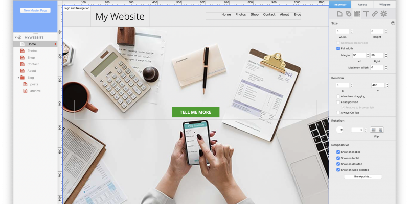
- New Rulers! EverWeb now includes horizontal and vertical rulers at the top, and to the left, of the Editor Window. The rulers use pixels as their measure. To toggle the rulers on and off use the Window-> Show/Hide Rulers option.
- New Responsive Theme Templates! Building on those introduced in EverWeb 2.8, the latest version of EverWeb adds more designs to use, inspire and learn from. Just use the EverWeb-> Check for New Templates… option to download all of the latest available Theme Templates. Once downloaded, when you add a page to your site, you can use the filter dropdown menu in the Theme Tempalte Chooser to see all of the ‘New’ or ‘Responsive’ Themes that are available.
- All widgets that include a hyperlinking ‘Link’ button, such as the Text Section and FlexBox widgets, now have the option to link ‘To a File’ and to open a link in a new window.
- In a similar vein, the Styled Text Editor used in the FlexBox, Text Section and PayPal widgets now all include the same options. In EverWeb 2.9 you can now use numbered, bullet or tick list style options in all of these widgets. You’ll find these options in the Styled Text Editor’s toolbar.
- Content Maximum Width comes to the Responsive Row widget. You can now set the maximum width that objects in the Responsive Row widget can take up. For example, you may have three objects in a row in a Responsive Row widget. The fist is 100 pixels wide, the second 200 pixels wide and the third 300 pixels wide. The objects will display side by side until you decrease the width of the Editor Window sufficiently so that the objects start to slide below each other. As you continue to decrease the width of the Editor Window, all three objects will eventually be vertically stacked instead of in a row.
You can use the Content Maximum Width feature in the Responsive Row’s Widget Settings to control when, or if, stacking takes place. Using the above three objects, if I set the Content Maximum Width at 301, the last object will always be below the first two. This is due to the fact that the combined width of the first two objects is 300 pixels. Add this this width to that of the third object would make the total width (100+200+300=) 600 which is over 301. Therefore, the last object is moved under the first two.
If you set the Content Maximum Width a value greater than 600 pixels, all three objects would display on the same row as their combined width is (100+200+300=) 600 pixels.
Conversely, if there Content Maximum Width was set to less than 300 pixels, all objects would be displayed one under the other.
The Content Maximum Width is an interesting feature which we will explore more in future posts!
- Together with Show on Device, EverWeb 2.9 allows you to manually set breakpoints for your pages. In this way you can define for yourself the point at which the page changes between one device type and the next. The ‘Breakpoints’ button that accesses the breakpoint settings can be found in the Responsive section of the Metrics Inspector tab. The settings also include the option to return to the default breakpoint values.
- Breakpoint lines can be displayed on the Editor Window with the new View-> Show/Hide Brekpoints menu option.
- Add custom CSS Classes. For those who have programming experience, you can now add CSS styling scripts to objects on the page using the new CSS Class dialog box in Advanced section of the Shape Options tab. You can use one or more custom CSS class in the dialog box as required.
- Set maximum widths for Full Width Objects. This is a great feature which helps full width objects becoming too widely spread out on desktop and wide desktops. When objects are too far apart you will see too much white space between each object in the row, so using this new option, reduces the likelihood of this happening as you can control the end width of the full width object.
What features would you like to see next in EverWeb? Let us know in the Comments Section below!
This post is also available in:
Français (French)


 Loading ...

Please give us ruler guides, horizontal and vertical. Thanks.
Hi Peg! Actually EverWeb 2.9 does include rulers along the top and down the left hand side of the Editor Window. You can toggle the rulers on and off using the View-> Show/Hide Rulers menu option.