 By
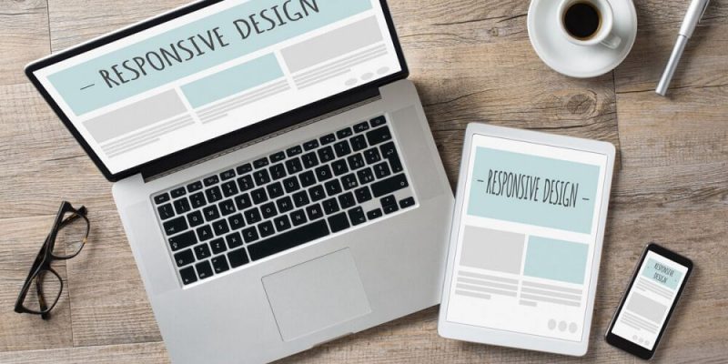
By Setting up a Responsive page in EverWeb gives you great way to create a truly scaleable page for your website. There’s no need to have to create separate pages for mobile, desktop or even tablet devices. Responsive Website Design is often touted as the Holy Grail of website design, but creating scaleable pages for your site also presents challenges and there are also some restrictions to page design that you don’t come across if you choose to create a fixed width design such as a Centered or Left Aligned Layout type in Everweb.
Designing your pages using a Responsive page layout relies on full width objects that scale appropriately as you change the width of your browser window. Getting the objects on the page to always fit the page no matter what the page width is can be a challenge. There’s also more need for testing your pages out before you publish them. This may result in a lot of tinkering just to get the page to look right at all times. Sometimes you may even need to pull your page apart and put it back together again to fix a problem. Responsive pages are great when they work, but getting there can, sometimes, take more time and effort than with a fixed width page type.
EverWeb comes with a host of widgets created specifically with Responsive website building in mind: The Responsive Row widget acts as a ‘bucket’ in which you can place fixed width objects if you need to (e.g. the PayPal Widget), the Responsive Image Gallery widget is a great way to display images with flexibility and flair, the Text Section widget allows you to combine Text with and image and all unlimited customizable, linkable buttons. Finally, the FlexBox widget is the Swiss Army knife letting you combine text, images, videos and a button all at the same time. Tweaking your page design can lead to lots of trial and error when using a widget’s Widget Settings so here are some hints and tips to help you make the process of getting your page perfect more quickly!
- Keep things simple if you can Often using widgets seem to provide the solution to everything when in fact they just add unnecessary complexity. I’ve seen many customer sites using TextBoxes within a Responsive Row widget for no reason at all. This just results in more work and more code being generated. Instead, use a Full Width TextBox and the Before/After Paragraph and Insert Margins options from the Text Inspector to manage the text inside the box. Use the Left and Right Margins options from the Metrics Inspector as needed.
- Content Maximum Width You’ll see this option in the FlexBox, Text Section, YouTube and Responsive Row widgets. It’s also available on the Metrics Inspector. The setting is used to put a maximum limit on how far content will stretch out in a browser window. This is useful to limit the spread of your content on wide screen displays. But which option to use? The one in the widget or the one in the Metrics Inspector? You can use either, actually, but there is a particular way in which you use the two settings together. The Metrics Inspector setting sets the maximum width for the object. The setting with widgets such as Responsive Row, FlexBox and Text Section widgets controls the maximum width of objects within the widget itself. As an example, you might have three controls in the FlexBox widget each of which is 240 pixels wide with a spacing of 5. You could set the Maximum Content Width in the widget to 600 with the Metics Inspector setting at 1000. In this scenario, you can only ever have two controls in the widget side by side.
- Use Percentages in Responsive Widgets You’re probably used to using pixels as the values you input in to the Minimum, Default and Maximum Width settings in responsive widgets. However, you can also use percentages instead. the advantage here is that your image will scale automatically to fit the browser window e.g. if you set an image of 1000 pixels wide to be 50% in the FlexBox Widget Settings, when viewed in a browser the image will scale appropriately at 50% until it reaches its 500 pixel maximum limit. This is incredibly useful and can save you a lot of time and effort.
- Use Zero If you want your image to take advantage of its full width within the widget, set the Minimum, Default and Maximum widths to zero. The image will scale automatically taking advantage of the full browser width. If you don’t want the image to be edge to edge in the browser, use the Left and Right Margin settings in the Metrics Inspector.
- Use auto The alternative to using zero is to use ‘auto’ which will do exactly what it says! This is usually useful in EverWeb to use when you have e.g. Height and width options available. Simply specify the width in pixels or as a percentage and then set height to auto. EverWeb will work out the height for you at all times.
- Check Your Alignment Some responsive widgets let you align the contents of the widget Left, Center or Right. The FlexBox widget additionally has alignment options for each control as well, and there are also left, center, right alignment options too for the Styled Text Editor. The Text Section widget too has its own image alignment options so if you have special image and text alignment requirements you may need to experiment a little to get the effect that you want.
There are lots of possibilities when using EverWeb’s responsive widgets, so learning some of the tricks as to how to get the best out of the widgets will bring out the best in your website’s content!


 Loading ...

Comments