 By
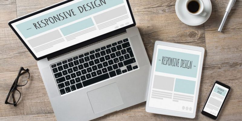
By Back in November 2018, EverWeb introduced Responsive Web Design to the product with the release of version 2.8. This milestone release led to many existing EverWeb users converting their websites from fixed width (centered and left aligned) page layouts to the new responsive page layout.
With any kind of conversion, there are always compromises along the way. The challenge when converting a site from fixed width to responsive is how to retain the feel of the old site whilst taking advantage of the new features, and potential restrictions, that responsive web design has.
For most web designers the main reason to move to responsive web pages is that they only need to design one page type which automatically scales appropriately to whichever device browser the page is displayed upon. The downside is that you lose the ‘free format’ nature that fixed width website page design gives you.
Since its introduction at the end of 2018, the responsive ‘tools’ available in EverWeb have expanded giving website developers more flexibility and creativity with every new release. EverWeb’s third party providers (especially EverWeb Widgets) have also brought new responsive widgets to market make truly professional websites possible for everyone.
One design possibility that I missed from designing fixed width websites was the ability to add a vertical ‘sticky’ Social Media Button bar to the side of my website. One of the compromises of responsive web design is that layering objects on top of each other is difficult to do, but there is a way in which you can create your own vertical Sticky Social Media Button bar. Here’s how…
Before You Start
Before you start, it’s worth mentioning that the Sticky Social Media Button bar is something that comes with a couple of caveats. First is that the bar should be placed on the left hand side of the page and second, the bar needs to be placed high enough on the page so that it can be fully displayed on any device from as an iPhone SE (or similar) upwards.
Adding the Sticky Social Media Bar
- Click on the Add Page button in EverWeb and add a new blank Responsive page to your site
- Next, go to the Widgets tab and drag and drop the Responsive Row widget on to the page.
- With the Responsive Row widget still selected, go to the Insert menu and use the Button menu option to add, for example, a FaceBook button in to the Responsive Row widget. Enter the URL of your FaceBook page in to the dialog box when asked then click OK. The button will be added to the page.
- Deselect the FaceBook button and select the Responsive Row instead. Just double click on the Responsive Row in the Editor Window to do this. You should see the Responsive Row Widget Settings displayed in the Inspector Window when you do this.
- Add all of the other buttons that you want to have in your Social Media Button bar in the same manner as the above two steps.
- Once you have finished adding the buttons you want, you should have a row of buttons inside the Responsive Row widget. These buttons are quite large at 64×64 pixels so you may want to resize them so that they are smaller. Hold the Shift key down on your keyboard and click on each of the buttons.
- With all of the buttons now selected, click on the Metrics Inspector if it not already selected, then change the button size to, for example, 32×32 pixels wide.
- The buttons will resize to their new dimensions in the Editor Window. Keep the buttons selected then click on the ‘Allow Free Dragging’ and ‘Always on Top’ checkboxes in the Position section of the Metrics Inspector.
- To make the column of buttons look better when it is finally in place is to have a background placed behind them. As you did before with the buttons, select the Responsive Row.
- Click on the Shapes button in the Toolbar, then select the Rectangle shape. A rectangle shape will appear inside the Responsive Row.
- In the Metrics Inspector, check the ‘Allow Free Dragging’ and ‘Always on Top’ checkboxes.
- Now take the buttons and the rectangle shape out of the Responsive Row widget completely. Select all of the buttons and the rectangle the press Command+X to cut them.
- The buttons and rectangle will now be on the Clipboard. Next, click on the empty Responsive Row widget and delete it from the page.
- Use Command+V to paste the buttons and the rectangle back on the page.Click somewhere else on the page to deselect the objects. Now click and drag one of the buttons around the page. You can drag the all of the objects around the Responsive page!
- Position the buttons in a column along the left hand side of the page, for example, all buttons could have an X value of somewhere, perhaps, between 3 and 6.
- You can space the buttons out evenly by selecting all of the buttons then using the Arrange-> Distribute-> Vertical menu option.
- Next, select the rectangle shape and if you want, change its color by clicking on the Shape Options tab and changing the Color Fill to the color you want.
- Once you have finished styling the background rectangle, move it in to place behind the buttons. Adjust the height and width of the shape as you need.
- If the background shape displays on top of the buttons, go to the Arrange menu and select ‘Send to Back’.
- To finish, select all of the buttons and the rectangle shape. Go to the Arrange menu and select Group so that the buttons and the background are always kept together.
Now that you have finished your Sticky Social Media Button bar, you can copy it to the clipboard and add it to your Master Page, or to any pages that you want it on in your site. When selecting a grouped objects, a thin border appears around the object group. It may not appear as if the group has been selected, even though it has been, so once you have selected the group, immediately copy it to the clipboard.
When adding the button bar, keep it high up on the page and towards the left hand edge of the page. In this way, it will always remain visible no matter on which device the page is being displayed upon.


 Loading ...

Comments