 By
By In the first part of our Conversion Therapy series, we looked at how you should prepare for converting your EverWeb website from a fixed width site to a responsive site. In this blog we look at what Responsive Web Design actually is and how it’s implemented in EverWeb. We’ll keep this post high level so that you just get the info you need to know without any frills around it…
Why Responsive Web Design?
If you’ve been using EverWeb since before November 2018 you’ll probably have designed your website with one page for desktop devices and a corresponding page for mobile devices.You would have linked the two pages together so that when published, your site would display the right type of page on the right device. To this day, this is a tried and trusted way of website design. It’s easy and straightforward. The downside is that you always have two pages to maintain and that with the plethora of devices with differing dimensions, your site may not look it’s best at all times.
Web designers, though, sought to find a way to make a one page, not two page, design possible where the page would automatically scale to fit whatever device it was being displayed upon. Through the continued development of HTML, this became possible.
How Responsive Web Design Works
Take a look at today’s most popular websites such as YouTube, Instagram, Twitter, Wikipedia and so on. What have they all got in common? The first thing to notice is that all these sites scale perfectly to fit whatever size your browser is. The second thing is that all the information you see on screen is arranged in rectangular boxes.
These rectangular boxes change dimensions according to the width of the browser. Anything inside the box reformats itself automatically to always fit inside the dimensions of the box. Each box has its own position in relation to all of the other boxes on the page so that everything remains properly formatted at all times.
A ‘box’ can take up the full width of the browser, or can be part of a group of boxes within one ‘supper box’. Some boxes may only appear on desktop devices and not on mobile devices, and vice versa. You may also find that boxes may contain more or less content depending on the width of the browser.
To see examples of these ‘boxes’, take a look at popular news websites as these sites show the box concept in the most prominent way. View the news site on a desktop computer and reduce the browser width. Typically, you will see less text in the boxes but larger images and headlines as you reduce the browser width.
Working with boxes allows you to scale content without having to worry about your page width. The price you pay for this is that your website design becomes box based rather than of a free design approach.
How EverWeb Implements Responsive Web Design
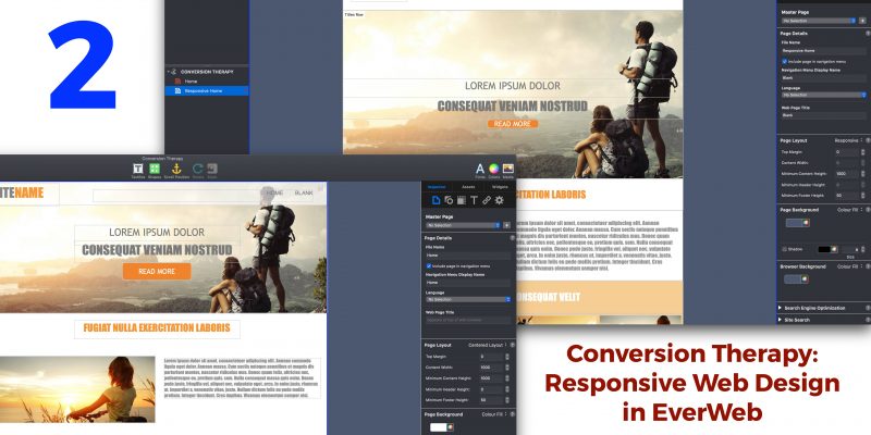
The design structure of Responsive Web Design easily fits in with the way in which EverWeb works. The Responsive Page Layout type is used create its responsive pages. When you create a new site or add new pages to an existing site, you can choose to add a blank responsive page or a responsive page from one of EverWeb’s built in themes.
When you add objects to a responsive page, they will be added as full width objects so you’ll find that the ‘Content Width’ field is greyed out. Full width objects are rows that are ‘stacked’ one on top of the other, from the top of the page downwards, each taking up 100% of the available page width. You can move these objects up and down the ‘stack’ just by dragging and dropping them to their new location.
Note that with Responsive pages there is no Header section. The ‘header’ in a responsive page is just another full width object so doesn’t require any special consideration. The Footer section, however, remains in place as a full width object as it serves as the end point of the page.
Full Width and Fixed Width Objects in Responsive Pages
There are a couple of exceptions to the ‘all objects are added as full width objects’ rule in responsive pages in EverWeb. The first is that a few of EverWeb’s widgets are not full width capable, such as the PayPal, Live Photo, FaceBook Like and FaceBook Page Timeline widgets. This leads us on to the second exception, which is when objects are placed within a Responsive Row widget. When placed inside a Responsive Row widget, objects can be either fixed width or full width. This means that widgets that are not full width capable, such as the PayPal widget, will always placed within a Responsive Row widget.
The Responsive Row widget is, in itself, an exception as it’s the only EverWeb widget that can’t be made in to a fixed width widget. It’s also the only widget that allows you to place other widgets inside of it.Use this widget when you want to place text, shapes, images or widgets as fixed width objects on the page. Remember that you will need to size the objects so that they display properly on all device widths. Usually the smallest device width allows for images of about 300 pixels wide. This may seem very limiting, as you may want your images to scale up and down depending on the device they’re being viewed upon. In this case, take a look at the Text Section and FlexBox widgets which should help you create scaleable images within your responsive pages.
Getting Experience in Responsive Web Design in EverWeb
The important point to remember when first getting to grips with responsive design is to experiment with it. In many ways things work exactly as they would do if you were designing a fixed width website. EverWeb works in the same way for both page layout types.However responsive web design is a different ball game and does require a different mindset as to how to create your website’s pages. Perhaps the best thing to do is to start by accessing some of EverWeb’s responsive theme template pages and seeing how they work. Most of the theme templates are designed to work with iPhone 8 upwards. The theme templates can give you insight in to how pages are constructed and the methods used to ensure that you get what you want from responsive web design in EverWeb.
Also, don’t forget that there are lots of EverWeb videos on YouTube about responsive web design to help get you started!
In the next chapter of Conversion Therapy, we will take a look at building a responsive page in EverWeb!
If you have any questions about this post, please let us know in the Comments Section below!


 Loading ...

Comments