 By
By In this blog post, we continue the work that we started in Conversion Therapy 3: Page Conversion – Part I where we started the work of converting a fixed width page layout in EverWeb in to a Responsive page layout. If you followed the last blog, you should now have the footer section of the responsive page completed. Now let’s turn our attention to converting the rest of the page!
Recreating The Page Header
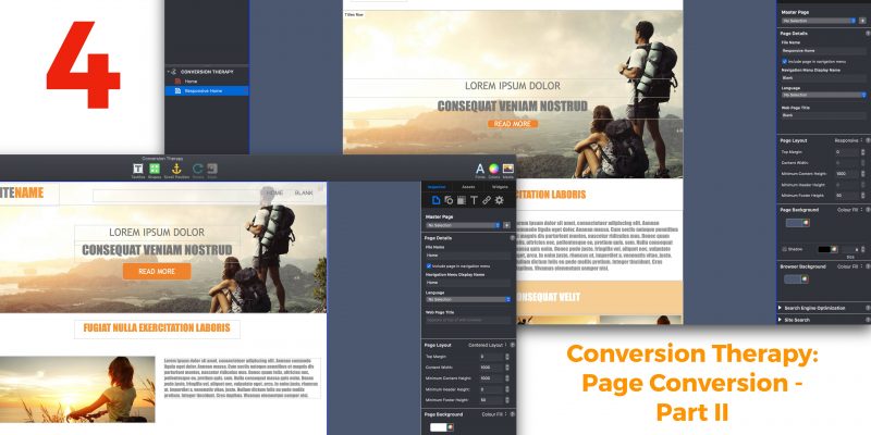
We can start by recreating the ‘Header’ section of the page. If you look at the original fixed width page, you’ll see that the header is made up of the logo text ‘SITENAME’ and a Navigation Menu widget. These objects are set on top of a semi-transparent, full width, white rectangle shape. Behind the rectangle is part of an Image Slider widget.
The first thing to note here is that Responsive Web Design does not use headers as in Responsive Web Design, the ‘header’ is just another full width object so you don’t need a specific header section. This means that all the settings for Headers in a Responsive Page Layout in EverWeb will be greyed out. The other thing to note is that this section of the page has objects stacked one on top of another. The text logo and navigation sit on top of the semi-transparent rectangle which sits on top of part of the Image Slider widget. In Responsive Web Design, objects tend not to be stacked on top of each other because when you resize the page, all of the objects’ relative placement may change which could make your page look a mess.
Deleting the Semi-Transparent Rectangle
To start, we will put the Text Logo and Navigation Menu widget together, but before doing so delete the semi-transparent rectangle at the top of the page as we can’t make use of it in the new page design.
The Responsive Row Header
To collect the text logo and navigation together we need to put them in to a Responsive Row widget at the top of the page. Add a Responsive Row widget to the page and move it to the top of the page if needed. Name the Responsive Row ‘Header Row’ in its Widget Settings. To add the text logo in to the ‘Header Row’, click on the ‘SITENAME’ TextBox to select it, then secondary click on it. Select Embed In-> Header Row 1. The text logo will move in to the ‘Header Row’. With the TextBox still selected reduce its width as much as you can then go to the Text Inspector and click on the Horizontal Alignment ‘Center’ button and Vertical Alignment ‘Middle’ button. Change the After Paragraph and Insert Margin settings to zero, Finally, use the selection handles to reduce the height of the TextBox.
The next step I to add the navigation not the Header Row. Click on the Navigation Menu widget to select it, then secondary click on it. Use the Embed In-> Header Row 1 menu option to add the navigation in to the Header Row. If the find that the text logo is displayed to the right of the Navigation Menu widget in the Header Row, drag and drop it to the left of the widget.
For the Navigation Menu widget, reduce its width so that all the page name labels fit without there being too much empty space. As the widget is currently selected, you will see its Widget Settings displayed. Check the ‘Responsive Navigation Bar’ option and Uncheck the ‘Use Background Color’ option below the ‘Menu Position’ option. These actions will make it so that a hamburger menu will display in place of the usual menu when the page is displayed on a mobile device and the text logo will remain visible at all times.
To finish the ‘Header Row’, double click on the Responsive Row itself. You should see Responsive Row Widget Settings displayed. As the TextBox and Navigation in the Responsive Row are right next to each other, we can space them out better by setting the Horizontal field to ‘Justify’. Now the objects are at each side of the page. You can add a margin by either using Insert Margin, or by going to the Metrics Inspector and adding Left and Right Margin values there. In this example, we are going to use the Metrics Inspector as the result will look better. Make the Left and Right margin values 30.
The Header is now complete!
Image Slider, Text, and Button Solutions…
The final part of the page contains the Image Slider widget, text title lines and a button with a call to action to ‘Read More’. In our responsive design it will not be possible to overlay the text on top of the Image Slider widget. Instead we will use a static image which will allow us to do this. There are many different ways in which we can approach this problem e.g. we could use the Text Section or FlexBox widgets, however, the easiest way is to use a Responsive Row widget.
To start, add a Responsive Row widget to the page and call it ‘Titles Row’. Next, add the background image you want to use. In this example, I am going to use the Mountains.jpg file. To add the image, go to the Shape Options tab. In the Fill section, change ‘None’ to ‘Image Fill’. Now click on the ‘Choose…’ button and select mountains.jpg from the Assets List. You may want to experiment with the different image scaling options. In this case, though, I am going to use ‘Scale to Fill’.
Using the Scale To Fill option, you may find that the top and bottom of the image are not visible at wider browser widths due to the scaling effect, but we can fix that. Go to the Widget Settings tab. In the Padding section set the Top padding to 200 and the Bottom padding to 150. Again, you may want to experiment here with what you prefer.
Now that the image is set in place, we can add the text titles in to the Responsive Row. Click on the first piece of text (e.g. LOREM IPSUM DOLOR) then go to the Metrics Inspector. Check ‘Full Width’. Next, secondary click on the text and select ‘Embed In-> Titles Row 1’. The text will now be placed inside the Titles Row Responsive Row widget. Repeat this process for the ‘CONSEQUAT VENIAM NOSTRUD’ TextBox.
For the button, select the button and adjust its height to 40 pixels, then click on ‘Full Width’. As the button is now the width of the page, we need to shrink it back down to size by setting its ‘Maximum Width’ to 150. Finally, secondary click on the button and again select ‘Embed In-> Titles Row 1’.
Finish the page by selecting the TextBox ‘Blank’, make it Full Width in the Metrics Inspector then place it below the image.
Your page is now complete!
In this blog we have covered a lot of ground and used a variety of EverWeb tools, features and widgets. In the next blog, we will look at some alternative options and how to test your page!


 Loading ...

Comments