 By
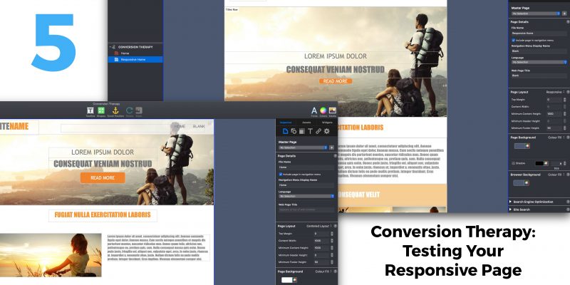
By In the last Conversion Therapy blog post we finished converting a fixed width page in to a responsive page in EverWeb. In this final ‘Conversion Therapy’ blog post, we’re going to look at testing your new responsive page and draw some conclusions from the experience of converting pages from one page layout style to another. First, testing…
Why Test Your Responsive Pages?
Testing is a vital function in the process of making your website. If your site doesn’t work properly when it goes live, or when you update your site in future, it will not create a good impression amongst your visitors. This could impact your business or your reputation, or both. You should test your pages no matter what style of page layout you are using, fixed desktop, fixed mobile or responsive. And lastly test everything you can, especially thinks like navigation menus and links. It’s always good for your visitors to land on the page you expect them to when clicking on a link!
Specific Testing of Your Responsive Pages
Perhaps the most crucial test for a responsive page is that everything on the page scales correctly no matter on which device the page is being displayed upon. A responsive page should always fit snugly within the width of the browser. The most common problem with responsive pages is that the page is actually too wide for the browser. You typically see this when viewing the page on smaller, narrower devices such as mobile phone. When viewed on a mobile device, if you can move the page from left to right when in fact you shouldn’t be able to, then you will know that there is an issue with the page design. When scrolling from left to right you may also find that there is a large blank space running down the right side of the page.
There are usually a couple of root causes to this problem: an object that should be full width has been made fixed width by mistake e.g, a TextBox. Select each object in turn that you expect to be a full width object. In the Metrics Inspector, the Full Width checkbox should be checked for each of these objects. The second cause of the problem is where you have a fixed width object that is simply too wide for the page that it is being displayed upon e.g. a 600 pixel wide TextBox placed within a Responsive Row widget will be too wide to display properly within a browser on a mobile phone. Such objects need to have their widths shrunk to fit, in this example the TextBox should be 300 pixels or less wide, or you should put the text in to a widget that can be scaled, e.g. a FlexBox or Text Section widget.
To find out more about solving this type of problem, check out EverWeb’s own video ‘Solving Horizontal Page Drift‘.
Targeting Your Testing
When it comes to testing your responsive page, use the responsive tools that come with your web browser to help you. For example, in Google Chrome use Menu-> Tools -> Developer Tools. This will allow you to view the page as if it were being displayed on different device types. If you are using Apple Safari, go to Safari -> Preferences -> Advanced and tick ‘Show develop menu in menubar’ if you don’t see a Develop menu in Safari’s menubar. When the Develop menu is visible select Responsive Design Mode. You will be able to see your page on a variety of Apple device types so, as with Google Chrome, you can test that your responsive page fits all device widths accordingly.
When testing pages in any browser’s responsive design mode, test your page on as many different device types as possible to see how the page will look. We’ve already covered the most common problem on mobile devices in the previous paragraph, but also look for problems on large desktop devices. You may find that the objects on your page are too widely spaced apart so that the page does not look aesthetically pleasing. In this case you may need to look at specifying a maximum content width of objects on the page. Some widgets have this setting e.g. you can set the maximum width of a Responsive Row or FlexBox widget. You can also find this setting in the Metrics Inspector tab. Check out EverWeb’s Maximum Content Width video for more useful information on this featue.
Conclusions
Recreating a responsive page from an existing fixed width page in EverWeb can produce very similar results to the original. Inevitably, there will be some differences between the two page types and you may need to compromise your original design to a degree to suit the new responsive paradigm. Getting to know responsive widgets such as the FlexBox and Text Section widgets will give your responsive design more options. Remember that the two design types are different and in some ways using a responsive page layout will mean learning some new ways of working. If you keep in mind how to avoid some common mistakes, you’ll soon be able to convert your whole fixed width site in to a brand new responsive design!


 Loading ...

Comments