Using the default navigation bar in iWeb has long been one of the biggest bugbears for iWeb users. Yes, it makes the job incredibly simple and adds the pages to your nav-bar as you create them and they are always in the same place on every page so they ‘continuity’ box is ticked but a user is unable to customize it to meet their needs.
You can’t do anything to the font or the colors so even if you did want to make even the tiniest of tweaks to your site you can’t. That is because the font and its colors are hard-coded within the theme code itself. I have a chapter explaining how you can edit the default navigation bar in my eBook, How to Design and build iWeb Themes.
[premium level=”1″ teaser=”yes” message=”Sorry, you need to be an active subscriber to view this post.”]
Not only that, but it isn’t very search engine friendly either. It’s all written in JavaScript which search engine crawlers find difficult to read.
So the answer is to create your own navigation bar. I have published a few posts about this before on AAi and the links are below. In summary though, if you can create a text box then you can create your own navigation; it’s that easy.
But what makes good navigation and what doesn’t? Here’s a few pointers to help you get yours sorted and to make sure that visitors to your iWeb site don’t get lost in your pages.
Naturally navigation on any web site has the sole purpose of allowing visitors go from one page to another. Good navigation also does something else at the same time. It tells a user where they can go and where they are now. Take a look at the screenshots of the new look navigation bar for the new Themes for iWeb site.
The links to the various pages are nice and big, the color contrasting against the background blue and the words used clearly explain what page a user can expect to reach if they click on a link. To show which page a user is on a large brown rectangle underlies the page name to help it stand out yet further. This navigation bar was all created in a basic text box, the hyperlinks added and formatted in Inspector then copy/pasted onto all of the other pages in the same place.
When I am designing iWeb sites the navigation is almost the last thing I add. While I am building the site I just use a text box in the right place and then sort out the formatting or any highlights once the site’s design is done. I found once to often that if I created a lovely nav-bar too early on and added to all of my pages I would think of another page and have to start again; a pain.
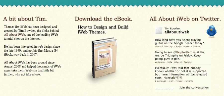
Of course there is more to navigation that just the nav-bar. There is the matter of links that appear on your pages too. In the screenshot below taken of the footer section of my new design you can see that links appear as brown text rather than plain black body text. You should make links stand out from your main text simply for the fact that users will know they have something to click on. But while you are concentrating on what color you should use for your links you should also try and remember that it matters what you have as the text for the link.
Basically the linking text should describe what will appear when a user clicks on it. An example of this is shown in the third line down on the left hand-side in the first paragraph. All About iWeb is a link, colored brown and if you click on the link you will be taken to All About iWeb. Gone are the days of ‘Click Here to download the file’ or the like.
Good basic navigation not only helps visitors to your site, it also helps search engines get around too. Once you think you have finished your site one thing you should really do is check ALL of the links. If you can get around your iWeb site easily then so can the search engines, and that can only be a good thing.
A good rule of thumb to keep in mind is the ‘3 click rule’. A visitor to your site should be able to visit every page within your site within 3 clicks of the home page. Anymore than that and there is a good chance they will lose interest and go somewhere else.
Useful navigation Tutorials for iWeb users
Improve your iWeb site’s navigation
Add a nav-bar with roll-overs to your iWeb site
How to add a javascript drop-down menu to your iWeb site
How to create a vertical nav-bar in iWeb
Add a fixed floating menu to iWeb
Add a drop-down nav-bar to iWeb with CSS
And finally here are a few inspirational post from various design blogs that concentrate on navigation. They make a great read.
Showcase of Creative Navigation Menus: Good and Bad Examples – Smashing Magazine
Horizontal Navigation Menus: Tips, Tricks and Showcases – WebDesignBooth
10 Websites with some unusual and interesting Navigation – Tech Blog
[/premium]


Comments