We now have a live iWeb site and thanks to our self-promotion on various social media networks, forums and other sites we have started getting in a steady stream of visitors. Okay so the numbers aren’t huge….yet, but give it time; it can take ages. This lesson isn’t something you necessarily have to consider straight away but might want to look at it if your site really takes off; we are going to make our iWeb sites mobile friendly.
There is a variety of things to take into consideration when designing a site for mobile users and we shall be touching on as many as we can. There are also a few links to some mobile web-site galleries for your inspiration.
[premium level=”1″ teaser=”yes” message=”Sorry, you need to be an active subscriber to view this post.”]
With so many different mobile devices offering so many different screen sizes and different browsers it goes without saying that you are going to need a separate version of your site for mobile visitors. But you needn’t panic. You do not need to recreate your iWeb site again just smaller, mobile sites are all about getting the best from what you already offer.
Navigation
Making it easy and obvious for your visitors to get around your web site is always important, but it becomes more so when they are using a mobile device. If a user is being charged for the amount of time they spend on-line whilst on their phone or other mobile device then they want to find what they are looking for as quickly as possible. In reality you shouldn’t need or even use the same navigation that you have on your full iWeb site, you just need the important pages.
You can check your Google Analytics stats to see which pages are getting the most hits on your site and which wants aren’t so that can help you decide which pages to include.
Keep the design simple
I know it may seem obvious but it is something you really must abide by. Once again, think of your users (and more particularly their phone bills) before you start building. Having an image heavy site that takes time to load is not good and mobile users will soon switch off and go elsewhere. Plain, legible text is the key.
Get with social media
Twitter and Facebook are everywhere now, even more so on mobile devices so including links to your social media accounts is a great way for mobile users to keep in touch and remind them that you are there. They may not remember visiting your site when they were in Starbucks but if they are sitting at home on their MacBook and see your entry in their Twitter feed it may jog their memory to check out your site in more detail.
Make sure your brand is what a user sees first
How many times have you visited a web-site, whether it is a mobile one or not, and not seen the site’s logo or brand name? As I have mentioned already a few times users of mobile browsers don’t have much time so getting your brand noticed first and foremost is extremely important.
Lose the bells and whistles
The real estate of a mobile browsers window is nowhere near as much as a regular computer or laptop. The last thing a user needs is flashy animated GIFs, unnecessary splash screens or lengthy forms to fill in. Don’t distract your visitors with clutter your mobile site does not need, just concentrate on the important content.
To redirect or not to redirect, that is the question
Once you have designed your site you now have another decision to make. Do you automatically redirect mobile users to your mobile site or do you let them make their own decision. It’s a toughy and there is no definitive answer. Me personally I would let the user decide because I know how annoying it can be being redirected to a mobile site when I am browsing on my iPad; but the choice is yours.
If you do want to automatically redirect users just use the code you can see below and replace the URL (in red) with the URL for your mobile site:
<script type="text/javascript">// <![CDATA[
var mobile = (/iphone|ipod|ipad|android|blackberry|mini|windows\sce|palm/i.test
(navigator.userAgent.toLowerCase()));
if (mobile) {
document.location = "http://www.yourdomain.com/mobilepage.html";
}
// ]]></script>
Place that code in the head section of your regular iWeb site’s pages (remember how easy that is using the iWeb SEO Tool?) and then publish your site. Just be prepared for complaints from users. Of course if you do get inundated you can always take the script out.
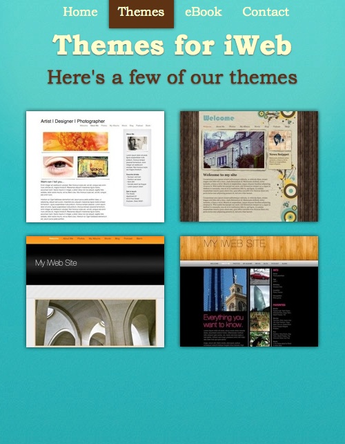
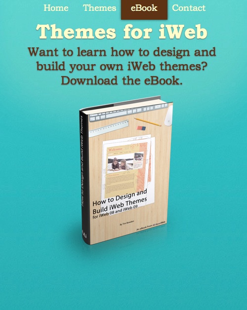
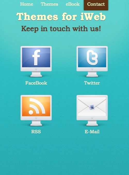
Here’s the mobile version of the Themes for iWeb site I built. I concentrated on the home page (naturally), a page showing a few themes just to whet the appetite of a visitor, there is a page advertising my eBook and finally a contact page. You’ll notice that the navigation is simple, just four pages with basic, clearly laid out design; no fuss or muddle.
I’d be interested to hear what you think.
If you need some inspiration for your mobile site take a look at a few of these sites, there is some excellent work:
Well that’s it folks, Day 21 had arrived. As promised you get to have the whole lot as an eBook but before I do publish the link I want to take this opportunity to ask you all if you have any questions about anything you have read over the last 21 Days. If you do, please either leave a comment or send me an e-mail though my contact page and I will then publish another post for all the subscribers answering those questions, along with the link to download the eBook. I hope to hear from you soon, and I hope you enjoyed the program, of course I would love to see all of your ‘new and improved’ iWeb sites, so why not send me a link too!
[/premium]


Tim, thanks for all the posts. I certainly had never thought of creating a mobile version of my site. Just to be clear, if I did not include the code that automatically routes a mobile user to the mobile version of my site would I have to add a button on the main homepage to allow the user to visit the mobile site instead? And presumably I could include a link in the mobile site that allows the mobile user to see the full site?
Gazbo,
Thanks for the comment. Yes you are correct, a simple hyperlink between sites is all that you need. Of course you could create one home page with the code added so that a mobile user goes straight to (and it designed for a mobile screen). On this page are the links to either the full site or the mobile site and the mobile user can choose which one to view. Of course as the code is only on one page if they select the full site they won’t be redirected back to the mobile site.
Tim
Hi Tim, it seems (hope not to be mistaken) that you didn’t talk about google maps and counter widgets. None of them worked when i published my site. Some other specifications would have been nice like how to get the right information when sharing your web on facebook (i mean, how to make the correct photo appear and the correct message displayed on the little sharing window). How to design the shortcut button displayed on the home screen of the iphone, ipod touch or ipad (not the favicon next to the address bar)?
Thanks for the guide Tim. Really useful. I liked the part of search engines. And the iweb SEO guide. I hope apple will keep upgrading iweb.
Greetings,
Claudio
Hi Tim,
Here’s what I did for my mobile site, I used java to direct people with a mobile device, directly to it. But, if they want to see the big site I have a simple link for always in view on the mobile version, so they can do so. I also have a link back to the mobile version, on the large site’s home page(the iphone icon). Check it out!
http://lightbehm.com